
Color is a powerful tool in fashion, capable of evoking emotions, making statements, and showcasing personality. While neutrals and muted tones often dominate wardrobes, the world of bold and bright colors offers an exciting opportunity for self-expression. However, for many people, wearing bold colors can feel like a challenge. The fear of clashing hues and creating a visually jarring outfit can make bold color combinations seem intimidating. Fortunately, with the right knowledge and confidence, anyone can pull off a vibrant, harmonious look by mastering the art of color pairing.
This essay explores how to wear bright hues without clashing, offering a guide on how to combine bold colors in a way that feels cohesive and stylish. By understanding the color wheel, playing with contrast and complement, and considering personal style, individuals can confidently experiment with bright colors and create eye-catching, fashionable outfits that don’t overwhelm the senses.
The Psychology of Color and Its Impact on Fashion
Before diving into the specifics of how to pair bold colors, it’s important to understand the psychology of color. Colors are often associated with certain moods and feelings, making them not only a form of self-expression but also a way to communicate messages non-verbally. In fashion, wearing certain colors can create a particular atmosphere or convey an emotion.
For instance, red is often linked to passion, energy, and excitement, while yellow is associated with positivity, warmth, and optimism. Blue tends to evoke feelings of calm and serenity, and green represents growth and harmony. Understanding the meanings behind colors can help individuals make intentional choices in their outfits, aligning their clothing choices with the mood they wish to convey.
Moreover, pairing colors strategically can enhance or soften these emotional cues. For example, combining bold colors like orange and blue can create a striking contrast that energizes the outfit, while pairing colors like green and yellow can evoke a more harmonious, balanced vibe. Learning how to mix and match bright hues effectively allows individuals to harness the power of color to reflect their personality and intentions.
Understanding the Color Wheel and Basic Color Theory
To successfully pair bold colors, a fundamental understanding of the color wheel and color theory is essential. The color wheel is a visual representation of primary, secondary, and tertiary colors, helping us understand how different colors relate to one another.
- Complementary Colors: Complementary colors are located opposite each other on the color wheel. When paired together, they create a high-contrast, vibrant look. Common complementary color pairings include red and green, blue and orange, and yellow and purple. These combinations can be bold and exciting, but it’s important to balance the intensity of the colors to avoid overwhelming the eyes. For instance, pairing a bright red with a deep green can create a more refined contrast than combining two equally intense shades of each color.
- Analogous Colors: Analogous colors are next to each other on the color wheel, and when combined, they tend to create a more harmonious and soothing look. These colors are often found in nature and include pairings like blue, blue-green, and green, or yellow, yellow-orange, and orange. Analogous colors create a sense of unity and flow, making them ideal for outfits that feel cohesive yet still colorful. These combinations are perfect for those who want to incorporate bright hues without creating too much contrast.
- Triadic Colors: Triadic color schemes involve using three colors that are evenly spaced on the color wheel. This can result in a balanced yet dynamic look, as the colors complement each other while maintaining a sense of contrast. Examples of triadic color schemes include red, yellow, and blue or orange, green, and purple. Triadic pairings allow for boldness while maintaining harmony, making them ideal for those who want to create an energetic outfit without feeling chaotic.
- Monochromatic Colors: A monochromatic color scheme uses various shades and tints of a single color. For example, pairing different shades of blue—from navy to sky blue—creates a sophisticated and cohesive look. While monochromatic outfits may seem less adventurous than other color combinations, they are a great way to incorporate boldness while maintaining a polished, unified appearance.
Tips for Pairing Bold Colors Without Clashing
Now that we’ve covered the basics of color theory, let’s dive into specific tips and tricks for pairing bright colors successfully:
- Start with a Neutral Base: If you’re new to experimenting with bold colors, start by incorporating bright hues into an outfit built around a neutral base. For example, a simple black, white, or gray top paired with a vibrant skirt or pants can make the bright color stand out without feeling overwhelming. Neutral colors help to anchor bold tones, providing a grounded base that allows the bright hues to pop.
- Balance the Intensity of Colors: When pairing bold colors, it’s important to consider the intensity of each hue. Pairing two intense, saturated colors—like neon pink and electric blue—can create a loud, clashing effect. Instead, balance one bold color with a more subdued shade. For instance, pairing a bright yellow top with a deep navy blue bottom creates a lively contrast that is visually stimulating without overwhelming the viewer.
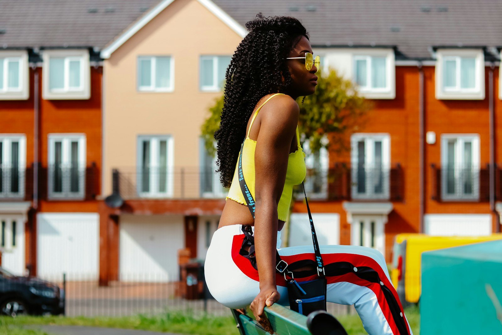
- Use Color Blocking: Color blocking is a technique that involves pairing large blocks of contrasting colors together. This can be a fun and bold way to experiment with bright hues while maintaining structure in the outfit. When using color blocking, it’s best to use no more than two or three colors to avoid creating a chaotic look. For example, a red top with a blue skirt and a yellow belt creates a striking color-blocked ensemble that feels both bold and balanced.
- Embrace Patterns with Bold Hues: Bold colors don’t have to be limited to solid colors. Incorporating vibrant prints and patterns into your wardrobe can add complexity and visual interest. Patterns like stripes, florals, or geometric designs can seamlessly blend multiple bright colors in a way that feels intentional and stylish. When working with patterned pieces, it’s helpful to pull one of the bold colors from the pattern and use it as an accent elsewhere in the outfit, such as in accessories or shoes.
- Consider Proportions and Placement: The way colors are placed in an outfit can also impact how they complement one another. For instance, bright colors that are placed near the face, such as a yellow top or a red scarf, can draw attention to the face and create a focal point. On the other hand, using bold colors on the lower half of the body, like a pair of electric blue pants, can ground the outfit while allowing the upper body to remain neutral. This strategic placement can help balance the boldness of the outfit.
- Use Accessories to Add a Pop of Color: If you’re not quite ready to dive into full-on bright color combinations, start small with accessories. A bold handbag, shoes, or jewelry can add an exciting pop of color without overpowering the rest of your outfit. Accessories are a great way to experiment with colors like bright coral, lime green, or fuchsia, allowing you to play with color trends without committing to an entire outfit.
- Know When to Add Texture: Texture can play a crucial role in how colors are perceived. A matte fabric, like cotton or denim, can make bold colors appear more grounded and subdued, while shiny fabrics, like satin or metallics, can amplify the vibrancy of the hues. When pairing bold colors, consider the texture of the materials to add depth and contrast to the look. For instance, pairing a matte orange sweater with metallic gold pants creates a striking and balanced combination of texture and color.
Examples of Bold Color Pairings
Here are a few examples of bold color pairings that work well together:
- Turquoise and Tangerine: These colors are complementary on the color wheel, creating a lively and energizing contrast. A turquoise blouse paired with a tangerine skirt or pants creates a playful, vibrant look that feels fresh and bold.
- Hot Pink and Electric Blue: A triadic color scheme featuring these two colors, along with purple or green, can create a bold, high-energy look. Opt for one dominant color—like a hot pink dress—and add electric blue accessories, such as shoes or a handbag, to keep the outfit balanced.
- Lime Green and Black: Pairing a bright lime green top with a black bottom creates a sharp, modern contrast. The black provides a grounding element, allowing the bright color to stand out without clashing.
- Yellow and Purple: This complementary pairing brings together two strikingly different hues that work together to create a bold statement. A yellow dress paired with purple accessories, like a belt or shoes, can make for an eye-catching outfit.